If you have read the article on Report writing but you are not sure how to implement it in practice, this article may help. It is the first of a series where I will look at published reports and review how they follow best practices in reporting.
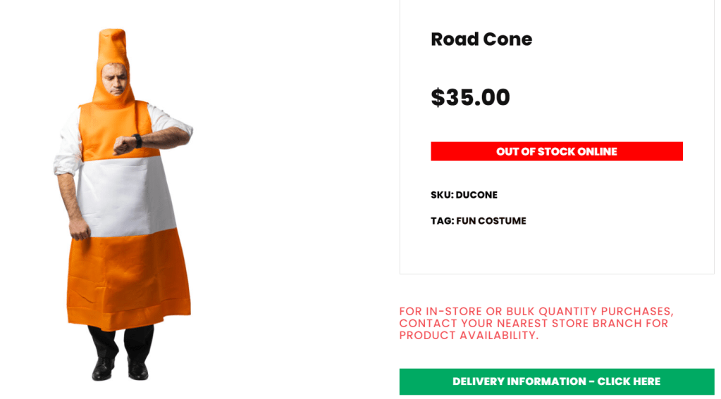
The report we look at is EY’s “Temporary Traffic Management in Auckland” which is probably not the most exciting topic unless you live in Auckland. Road cones are are a contentious issue here, and a popular Halloween costume (screenshot below is from https://www.looksharpstore.co.nz/)
So let’s look at the report.
It is a slidedoc
A slide doc is a document in presentation (landscape) format but designed for reading rather than presenting. This makes sense because most reports these days are read online and not printed out.
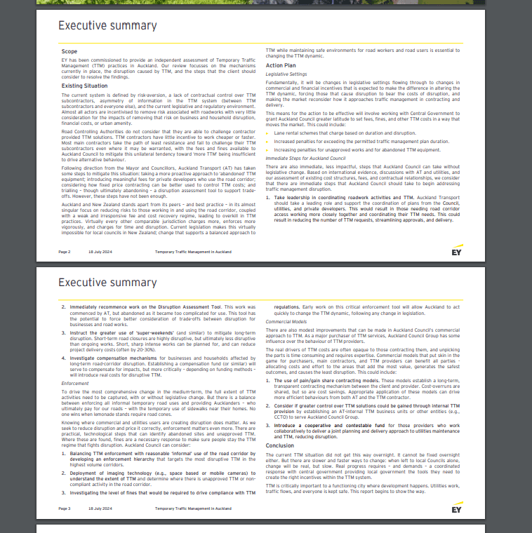
It starts with the findings
On the first page after the title page, after four lines describing the scope, the authors get right to the point and list the things that are wrong with the current systems. People who learned to write in an academic environment often start with methodology, background, literature review etc., even in the executive summary – before the findings, whereas the audience wants to see the findings first.
There are graphics for signposting and to provide visual variety
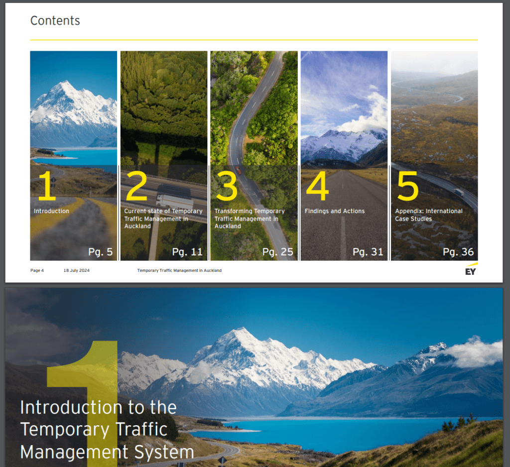
Not all pages need to have illustrations, and the report has many text-only, information-dense pages. In this case, the table of contents and section titles are an opportunity to make the document visually pleasing.
A lot of the qualitative information is presented in tables
Instead of writing paragraphs of text, much of the information is organised in tables using colour-coding and icons to communicate the assessment.
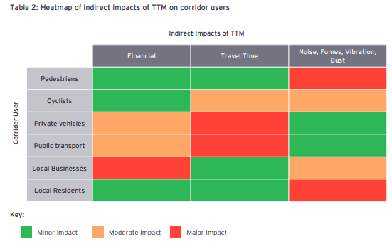
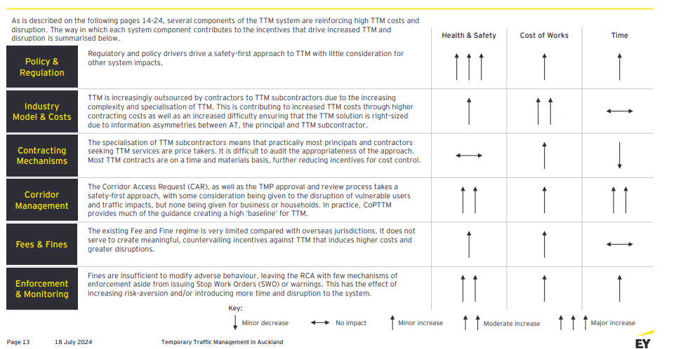
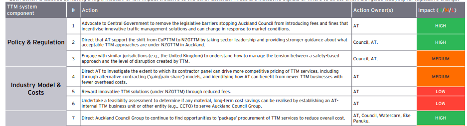
And these are not all of the tables in the report – there is more. Tables are easier to read than walls of text, and classifications and colour-coding help reduce the word count while retaining the information.
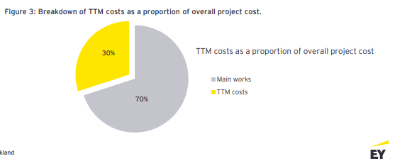
Graphs are clean and fit for purpose
A pie graph should be used only to compare 2-3 categories to show how even/uneven they are – with more categories, the slices become hard to compare and a bar or column graph is better choice for readability. Here is a pie graph used correctly – although the title could communicate the findings (TTM costs are 30% of overall project cost) and the slices could be labelled directly.
The report uses breakout boxes to highlight key points
In the page below, there is a table (running over two pages) with a lot of technical detail that not everyone will be interested in or have time to read. The yellow box summarises the key information, allowing the reader to skim.

The main content is less than 30 pages
If you don’t count visual title slides, appendix pages and the legal stuff, the substance of the report is condensed to about 30 pages with information.

Speaking of legal, I acknowledge EY’s copyright of the report. My use of this report is fair dealing (a NZ term similar to fair use in the US) where it is permitted to use copyrighted material for the purpose of research, review and criticism.
