When I moved from academia to government I quickly learned that reporting on evaluation and research works differently from what I learned in academia. It is more focused on findings and their interpretation, with less emphasis on methodology, theories and literature review.
Focus on the client and their questions
Identify who will take action based on your research or evaluation. We will call them your “client” even if it is someone internal. Then, identify what the client needs to know to take informed action (or to decide to take no action). Give that information to them at the very beginning of your report, clear and undiluted by what other audiences are interested in. Information for other audiences (your research participants, colleagues) can go into the second part of the report, appendices, boxes, footnotes or a separate presentation. Most common pitfalls are writing for our academic colleagues, for the participants of the qualitative research, or for our managers or internal peer reviewers.
When you write for academics, you put literature review and methodology at the front. When writing for non-academic audiences, these should be in appendices. When you write for your participants, you cite verbatim too much and go into too much detail about what people said instead of summarising the themes, because you want your participants to see themselves reflected in the report and their voices honored. Doing this, most of the time you’ll bore the decisionmakers. When you write for managers or other internal peer reviewers, you are at risk of overusing organisational jargon, or unnecessarily referring to whatever buzzwords or strategies are currently trending in the organisation.
Think about which data points are necessary to support your responses to the client’s questions and make an effort in how you present these – the rest of the data can be in an appendix or even a linked Excel file with minimal formatting. This saves a lot of time if you used to make beautifully formatted tables and graphs for all your data like I did! People were appreciative of how clear the reports were when not overburdened with all the unnecessary extra data that I wanted to present just because it existed.
Make it skimmable
The truth is that few people (or no one) will read the whole report. Different audiences will scan it for different bits of information.
There should be a clear visual hierarchy of information in the report. Reading just the headers should give the reader an idea of what the report says – make your headlines meaningful summaries of the main point. For example, “There is demand for summer reading programmes from parents” rather than “Survey results” or “Attitudes towards summer reading programmes”. Use side columns, call out boxes and other design elements to layer information. Consistently deliver the same type of information (data, participant quotes etc.) in the same format so that the readers who are interested in only one of the layers can quickly find their way.
Use the pyramid principle to organise information
“The pyramid principle” is a title of Barbara Minto’s book that proposes that “ideas in writing should always form a pyramid under a single thought”. You start with the main insight or idea and present supporting ideas and data below it. In the form of a bullet list, it looks like this:
- Main idea 1 (To maximise service use we should locate our service centres in shopping malls)
- Supporting insight 1A for Main idea 1 (our target population visits shopping malls regularly)
- Data point as evidence for insight 1A – percentage of target population who visit a shopping mall weekly
- Data point as evidence for insight 1A …
- Data point as evidence for insight 1A…
- Supporting insight 1B for Main idea 1 (Locating this service in shopping malls was successful in another city similar to our city)
- Data point as evidence for insight 1B
- Data point as evidence forinsight 1B
- Data point as evidence for insight 1B
- Supporting insight 1C for Main idea 1 (Locating service centres in shopping malls is cost-effective compared to stand-alone centres
- Data point as evidence for insight 1C
- Data point as evidence for insight 1C
- Supporting insight 1A for Main idea 1 (our target population visits shopping malls regularly)
- Main idea 2 (To maximise service impact we should…)
- …
If you organise all of the information in your report in this way, people will find it easy to follow. It will also force you to be disciplined about what you are trying to say and whether the data you include in the report has business being there.
Make it easy to read
Use plain language and use the Hemingway Editor or a similar app to check how hard your writing is to read. Credibility comes from the quality of the evidence, not from an overly academic language that will be alienating for most of your audiences. Use tables, diagrams, maps, icons and other visual elements to break up text. There are many ways to present qualitative information in an attractive form rather than a wall of text.
Consider the format in which your report will be read. If it is not likely to be printed on paper, a slidedoc (presentation format but designed for reading without a presenter narrating it) is easier to read on screen than an A4 page and this is the format I see many consultancies adopting. Sometimes, an interactive website, internal or public-facing, is the most user-friendly solution.
Follow best practices for data presentation
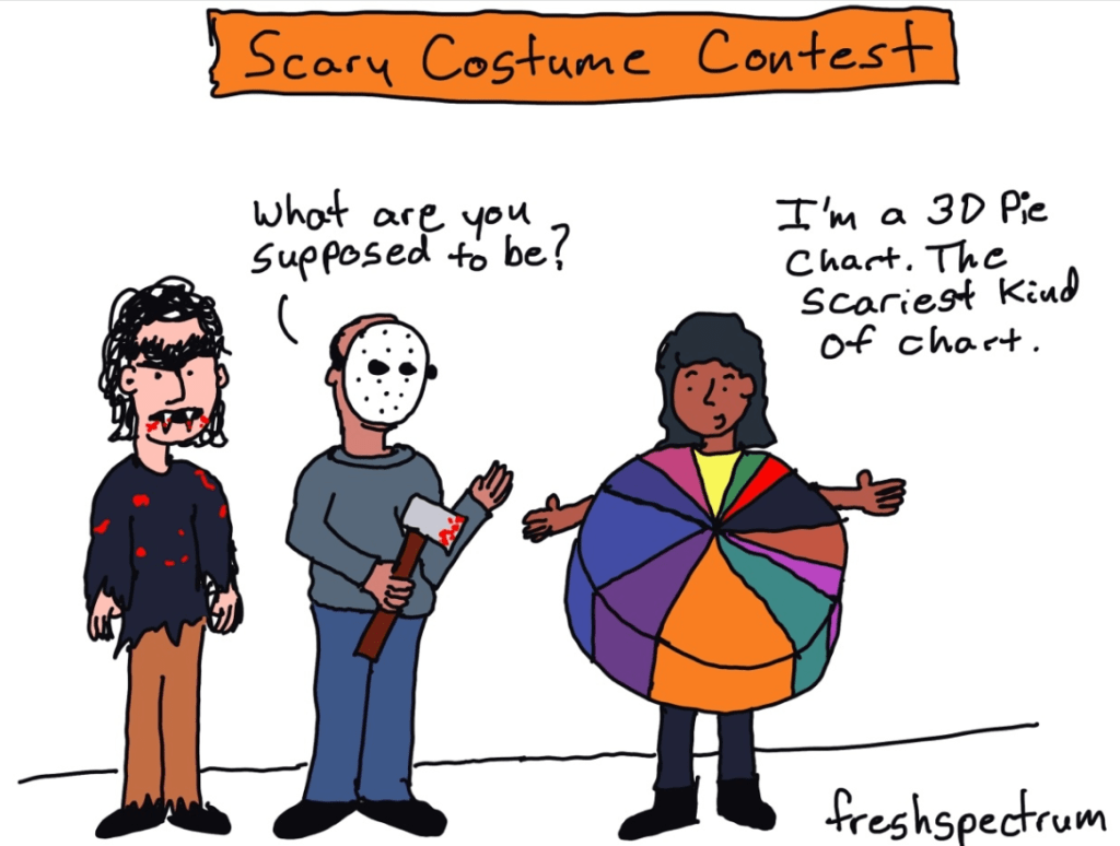
Use the right type of graph for the type of data, label data directly, remove any visual clutter that does not add to the information. You can learn a lot by reading through the archives of the free blogs of Stephanie Evergreen and Ann K. Emery and from Chris Lysy’s cartoons like the one below.
Create several reports as you go
If you work as an in-house evaluator or researcher, you will likely present your work multiple times to different internal audiences. Have these audiences mapped out at the start, and create the presentations, infographics and mini-reports as you write the report, distributing the information across the documents. I would typically present to decisionmakers, operational staff involved in the project / programme, the wider department, the research and insights community of practice and perhaps other teams and departments if the findings involve them, for example I might present to ICT in more detail if one of the findings is that insufficient ICT support affects outcomes.
Some of the stuff I advise to put into appendices in the main report because it is not essential for your client may be the primary item of interest for one of your other audiences, and it would have a more prominent place in the report for that audience. If you plan from the start how you distribute information across multiple documents and do it as you go, creating multiple reports it is not much extra work, and it will result in better engagement than one main report.
